Academic Journal: Digital Culturist.
This journal has a modern, simplistic design that takes advantage of its negative space. Along with being appealing to the eye, its Our Mission page establishes a casual voice, utilizing imagery that helps the reader to understand its message. Digital Culturist explores the relationship between humans and technology. It recognizes the pervasive role of technology in our lives, and it is determined to help us better understand that role.

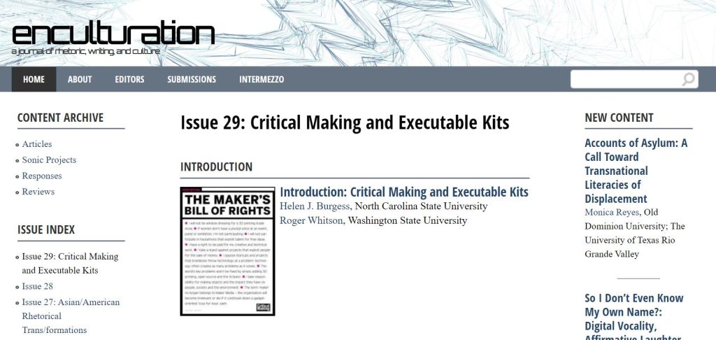
Academic Journal: Enculturation.
I did not choose Enculturation for its appealing design, but rather for how its traditional, formal design serves as a point of comparison for other digital publications. It is plain, white, and uses Times New Roman for its body texts. The only style deviations are in the menu bar and the busy, confusing, and disorganized heading image that displays the journal’s name. While the visual rhetoric lacks appeal, its About page makes it very clear that the journal appreciates articles and reports that apply multimedia. This artistic claim has a strange contrast with the journal’s unimpressive design.
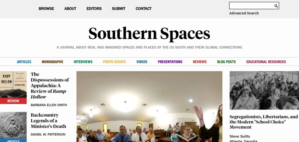
Academic Journal: Southern Spaces.
Southern Spaces is immediately eye-catching and engaging with its high use of images, color, and visual hierarchies in text. Additionally, I found the journal’s mission to be an intriguing one. Southern Spaces publishes research and scholarly articles that discuss the culture, spaces, and ideas, “real and imagined,” that particularly take place in the U.S. South.
News/Culture Publication: Business Insider.
Like Southern Spaces, Business Insider appreciates visual rhetoric with large images and text headings. It leaves more negative space, however, perhaps overwhelming the reader less and increasing readability. There’s no About page, but it’s clear that this journal’s purpose is to publish news on business, politics, and technology.

News/Culture Publication: Huffington Post.
If Southern Spaces to Business Insider were a range from Most Visual Clutter to Least Visual Clutter, Huffington Post would fall between the two. Its design stands out for its widespread use of bold text and a black-colored page heading. Like Business Insider, there’s no About page, but a glimpse at the menu bar shows that it specializes in entertainment, news, life, politics, and reporting updates on popular current events, like the 2020 U.S. elections.

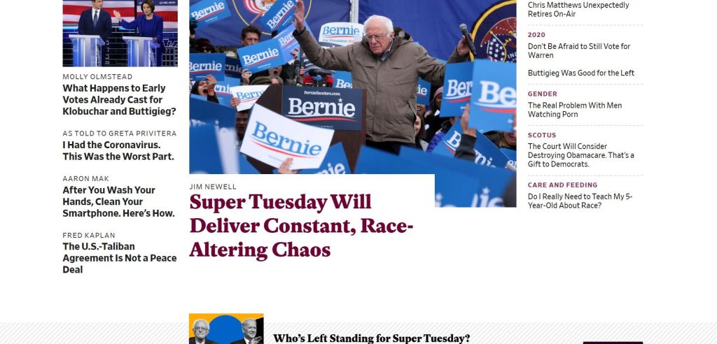
News/Culture Publication: Slate.
Slate magazine organizes its Home page with clear headings for technology, culture, and more. It contains photographs like the other news sources examined, but it also uses graphic art to communicate the topics of its articles. Like Huffington Post, it utilizes bold text, but it does so selectively, helping the reader to not be overwhelmed by continuous dark, important-looking text. The magazine is known for its “witty take” on news. So while it publishes articles on news, culture, technology, business, and human interests like the other journals, it does so with a unique and interesting style.